[uploaded 4 testing] zm_pollution

Makaify

Well-Known Member
Mapper
Donator
20 May 2017
112
152
43
31
Finland
Hello!

This is zm_pollution

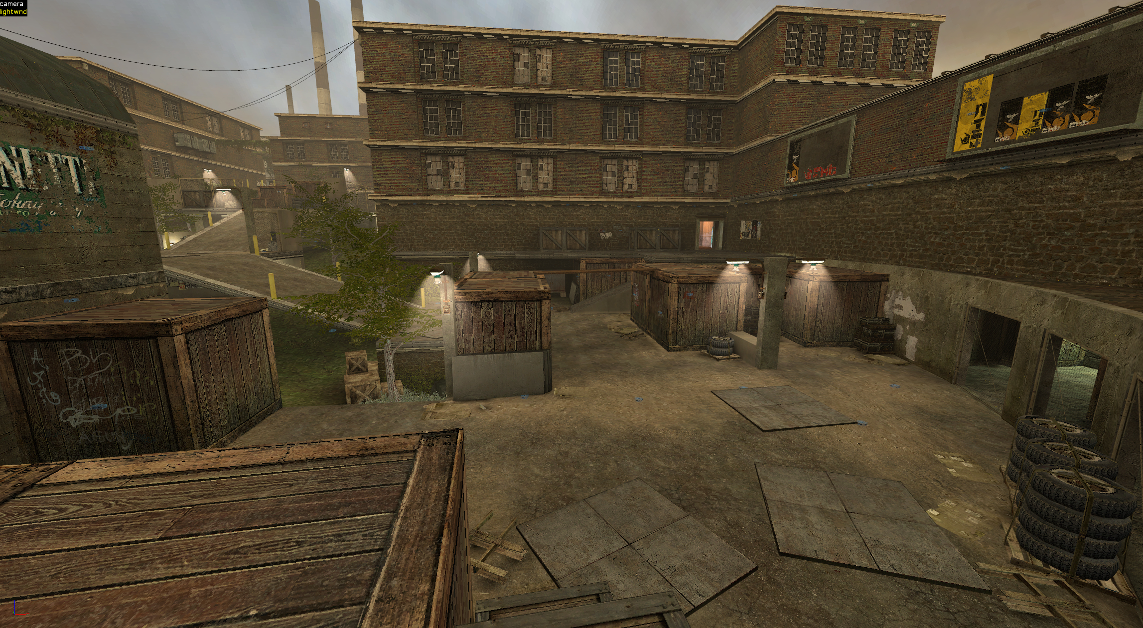
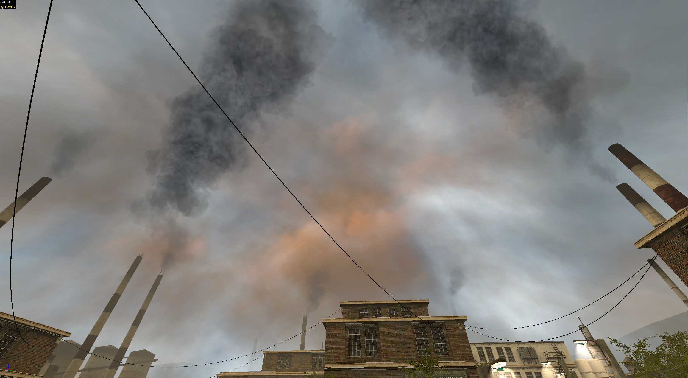
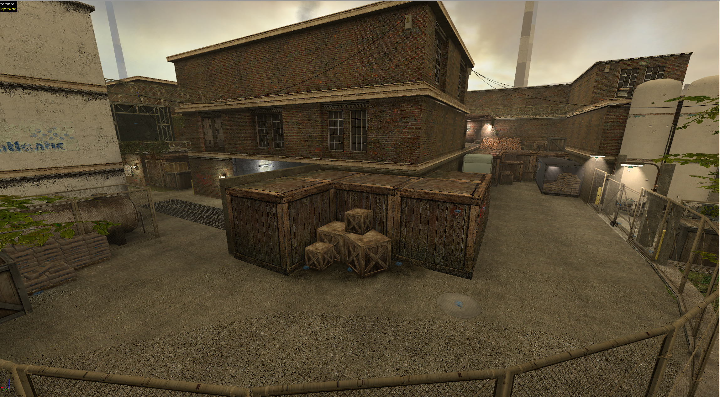
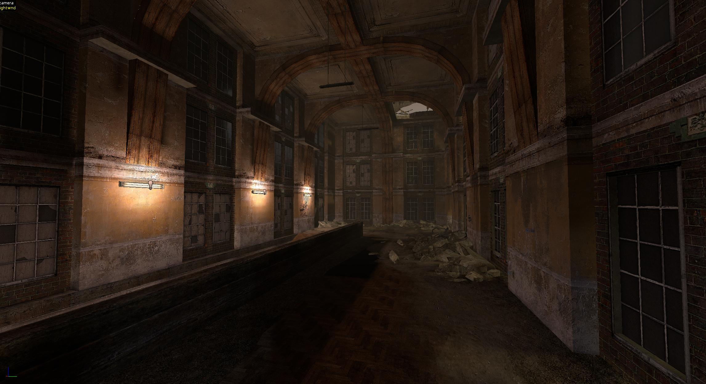
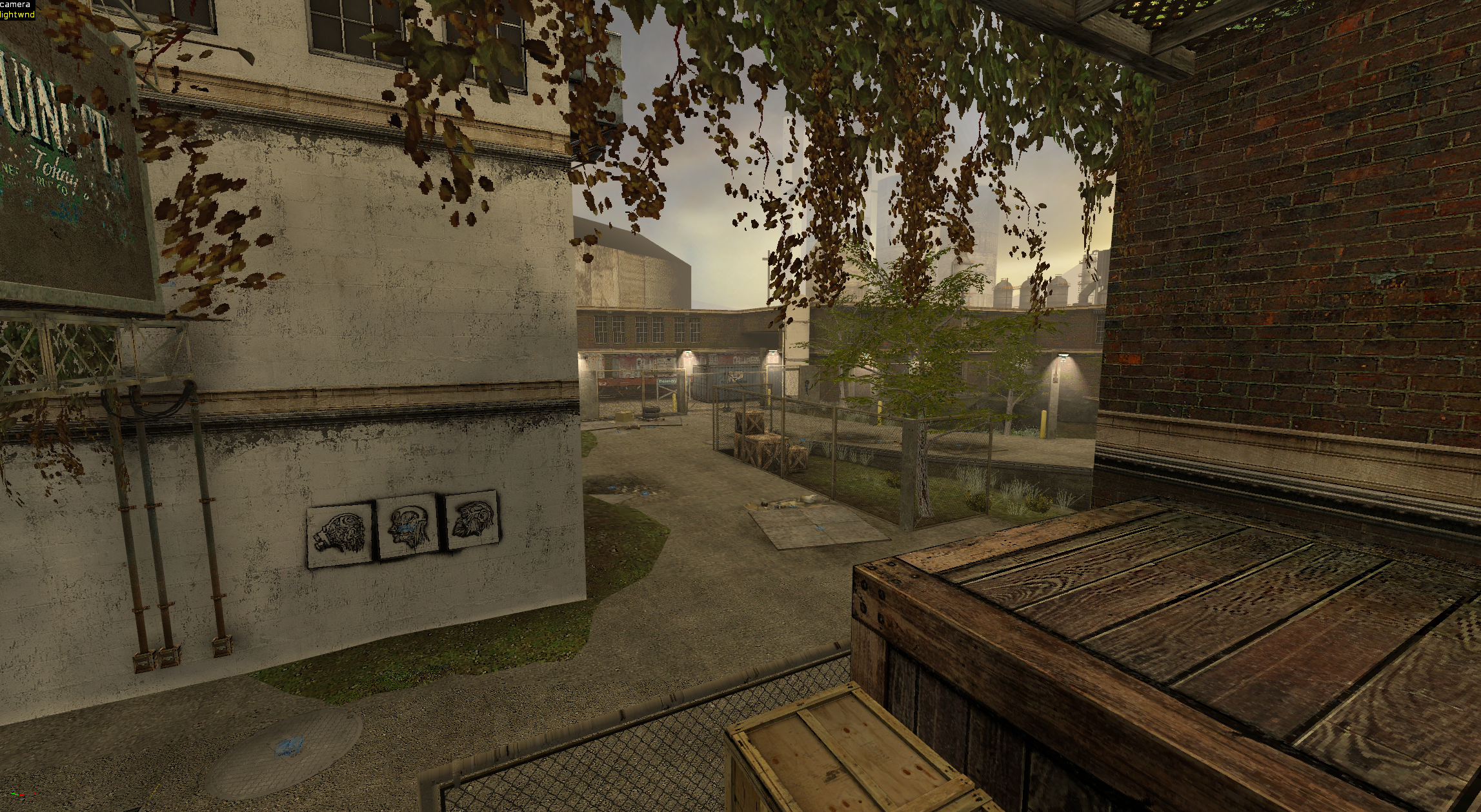
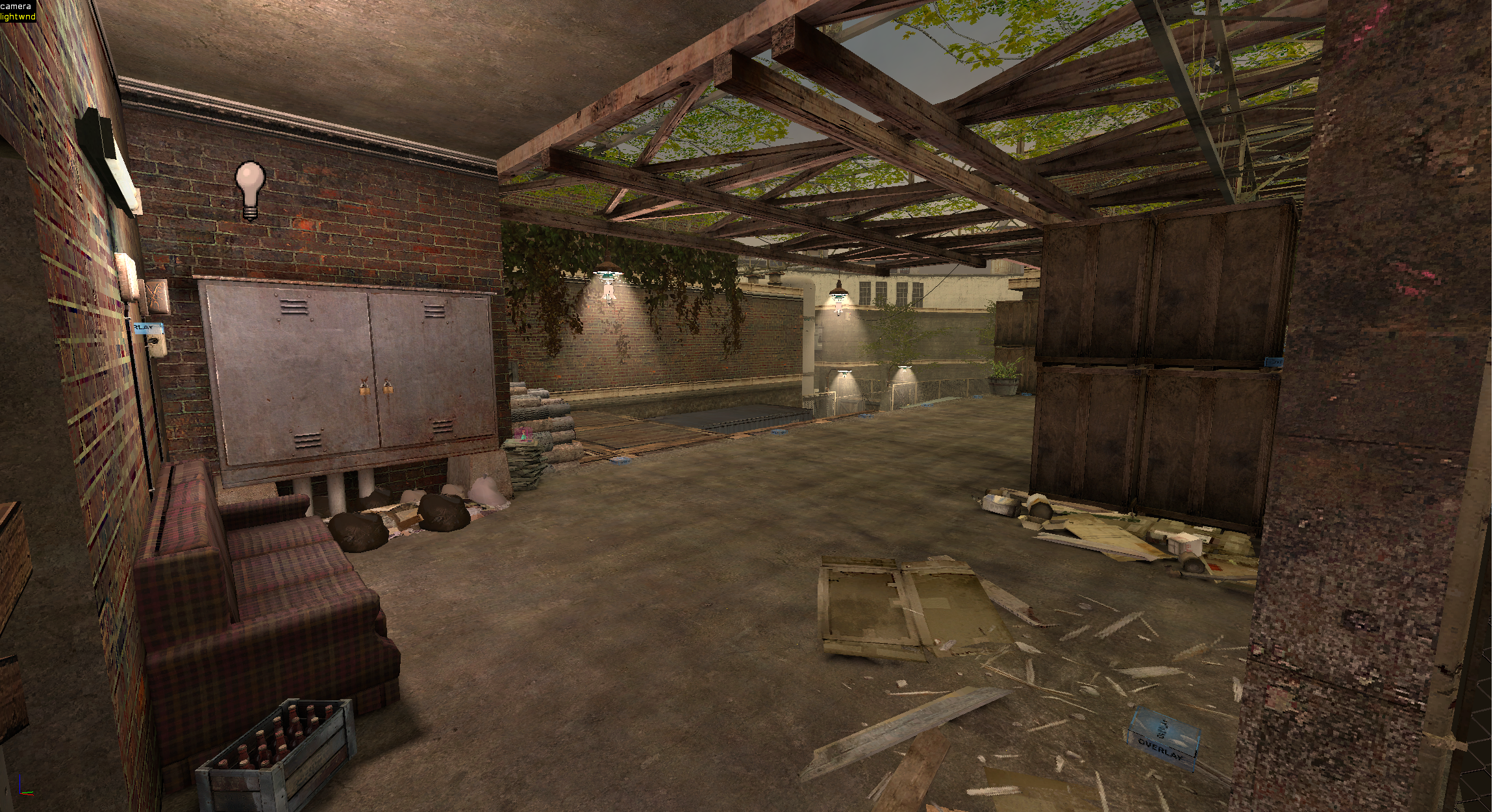
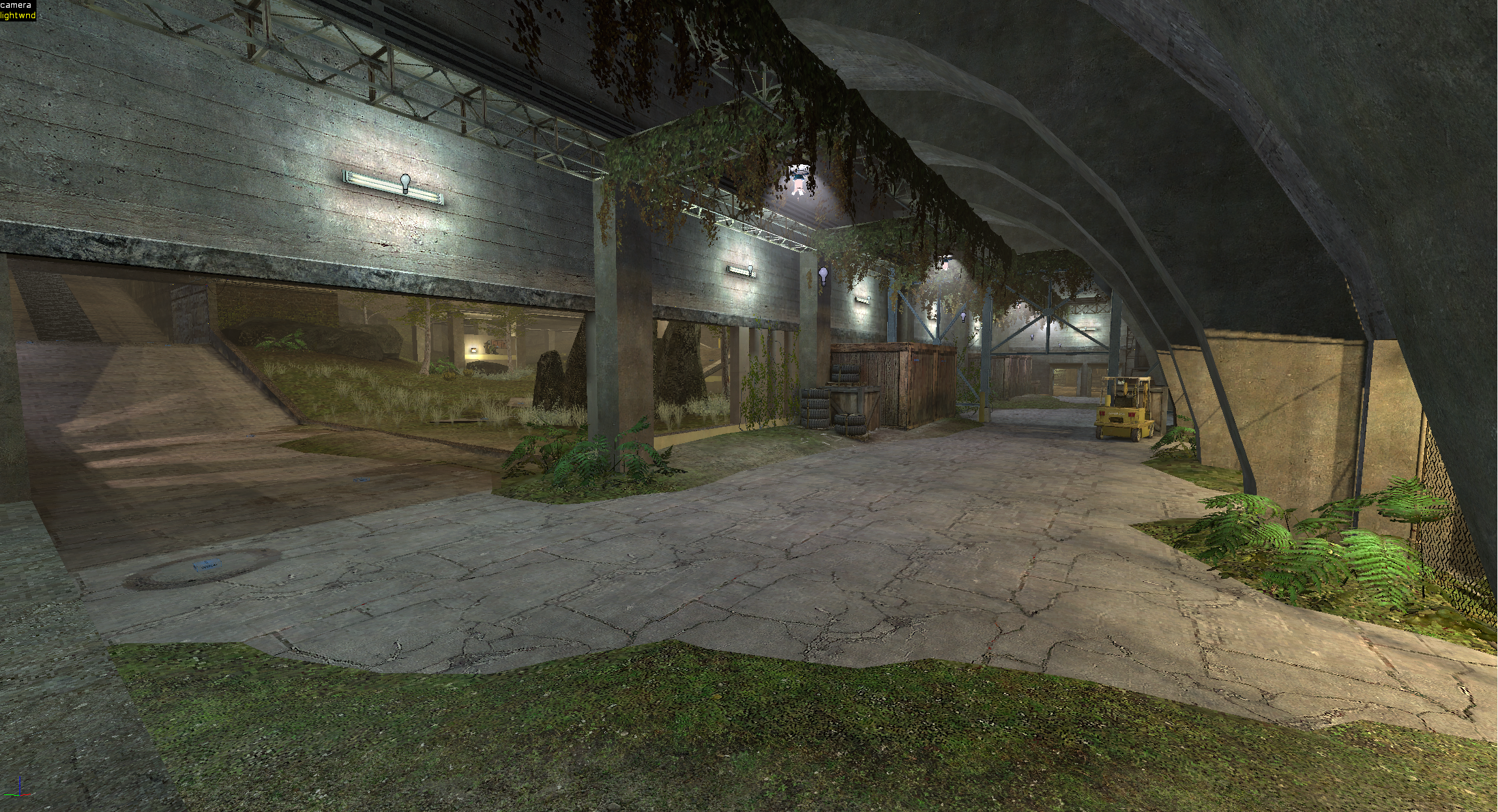
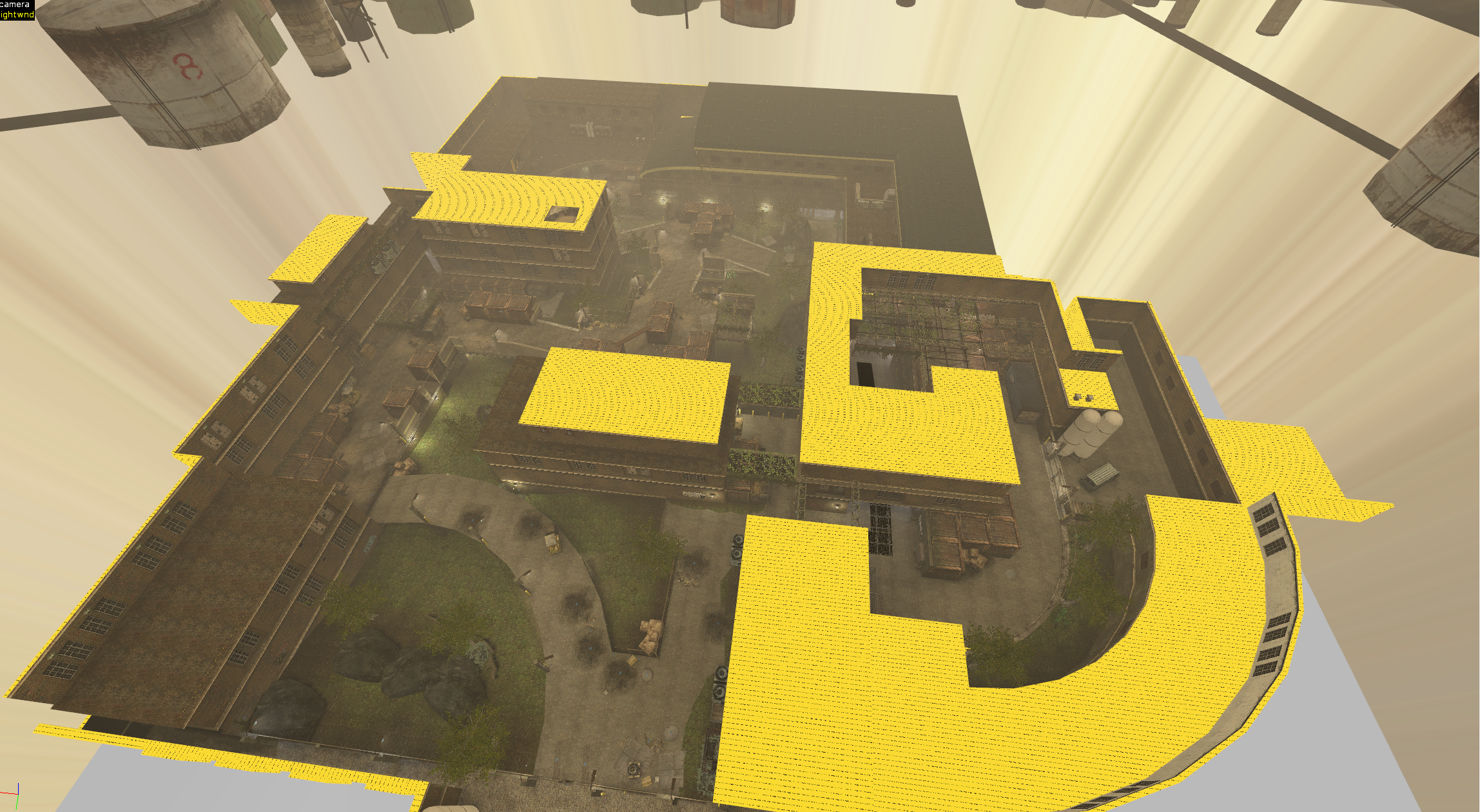
It has been a while since I posted something that I've been working on. This is a project I started in September last year. It has been a long road for the map to reach this point, indeed. The map is kinda big, but not too big in my opinion. Over the course of development, the playable area has been reduced. It's probably going to take a few more weeks to publish the map. Im only working on it on the weekends. Just today I finished the 3d skybox, which is animated with heavy smoke etc. I will post some Hammer++ screenshots below, so please let me know what you think.
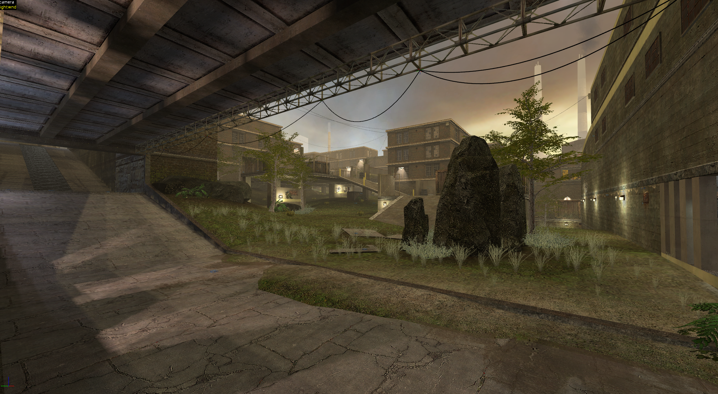
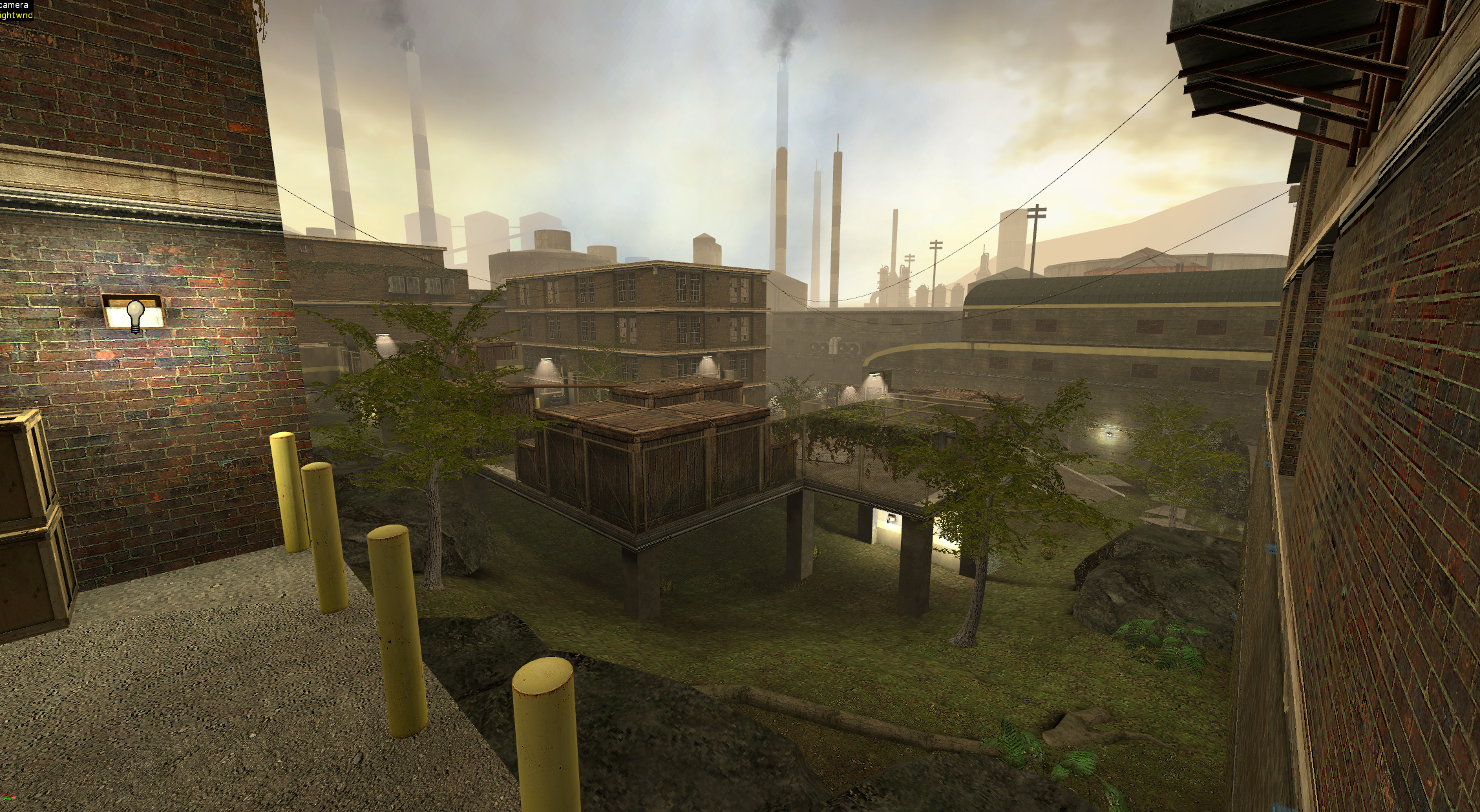
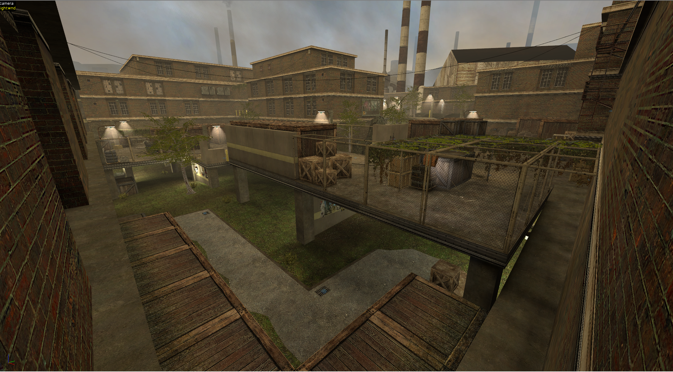
Näyttökuva 2024-02-24 221807.png
Näyttökuva 2024-02-24 221636.png
Näyttökuva 2024-02-24 221615.png
Näyttökuva 2024-02-24 221742.png
Näyttökuva 2024-02-24 211157.png
Näyttökuva 2024-02-24 221920.png
Näyttökuva 2024-02-24 221534.png
Näyttökuva 2024-02-24 185944.png
Näyttökuva 2024-02-24 221935.png
Näyttökuva 2024-02-24 185827.png
Näyttökuva 2024-02-24 185728.png
Näyttökuva 2024-02-24 224634.png
 
seems cool,it's giving me zm_examen vibes,mind if you drop the .bsp?
 
looks really good, gives off some good postapocalyptic vibes which is very fitting for zm. honestly a pleasure to just look at those screenshots
 
  • Like
Reactions: Sauce
bloody spectacular looking shit mate, if testing goes well i hope we can have it on rotation asap!
 
Thanks for the kind messages. Right now Im working on optimizing the map. After that, only a few things like spawnpoints and soundscapes remain to be added. Hopefully I will be able to publish a bsp tomorrow. :)
 
  • Like
Reactions: Nikooo777 and Woozu
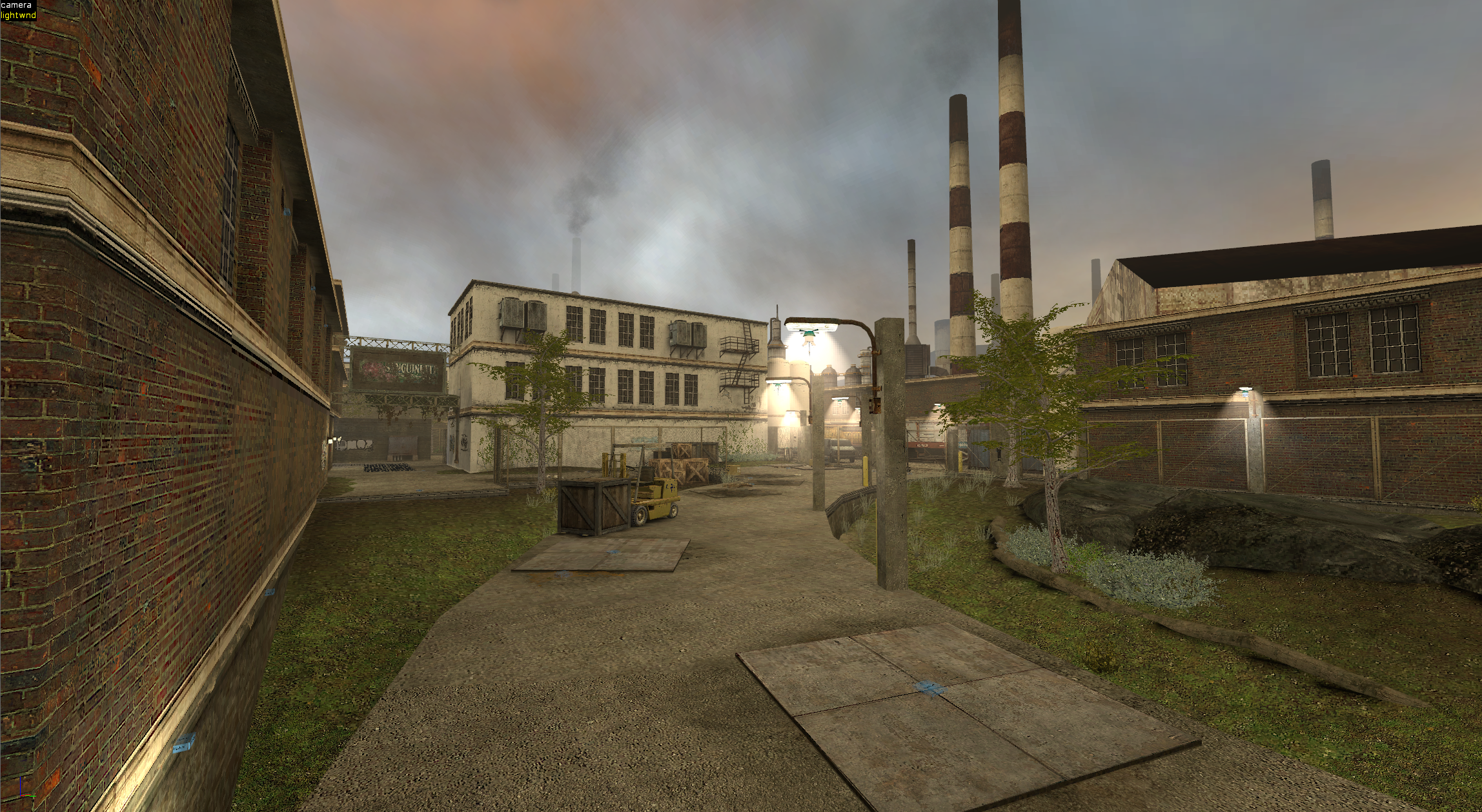
Alright, I'm dropping the 1st test .bsp. This is only meant for local testing.

Please let me know what you think. I'm especially curious to know how you think the camp spots will play out. I haven't played the game in years, so honestly Im not too sure. I think I need to add more props to most spots. Btw. you can break windows in some locations.
Known issues:
Water graphics glitch (weird triangle)
Shadow issues with some props
Some areas need more light
Hula dancer doesn't dance when told to

I wasn't able to completely finish optimizing the map for this test version. A few areas also need some more detail and cubemaps adjusted. All to be added in future versions.
 

Attachments

  • zm_pollution_test1.bsp
    30.7 MB · Views: 76
  • Like
  • Wow
Reactions: SOUR and Soup^
It's actually the first time I hop on to a map and can't find anything to say that needs fixing.
Well obviously other than the things you yourself have mentioned. ( so sad the hula dancer doesn't dance whenever I press E on her :( )
Map is absolutely brilliant,I launched it offline and literally just walked all over the map for like an hour if not more than that.
So satisfying,a lot of space,no overpowered spots or anything+ the atmosphere is chilling.
If you ever manage to fix these minor issues you mentioned,this map needs to be tested,I see great hunting potential in it. Bravo sir.
 
  • Like
Reactions: Makaify
Test 2!

Hula dancer now dances
Water graphics glitch is fixed
Added light throughout the whole map.
Fixed props with weird shadows.

Also continued working on optimizing the map. It's better, but still needs a few tweaks. I also added a map spawn-in view. Other minor tweaks here and there. This one is a quick test version, as I will upload the finished version tomorrow! :)
 

Attachments

  • zm_pollution_test2.bsp
    31.1 MB · Views: 70
  • Like
Reactions: Mol and SOUR
Test 2!

Hula dancer now dances
Water graphics glitch is fixed
Added light throughout the whole map.
Fixed props with weird shadows.

Also continued working on optimizing the map. It's better, but still needs a few tweaks. I also added a map spawn-in view. Other minor tweaks here and there. This one is a quick test version, as I will upload the finished version tomorrow! :)
Hello, you have created an interesting map. Good for hunting. In some places, the roof can also be covered with a nodraw texture, or part of the brushes of some roofs, which are only partially visible to players. In the demo I showed where.
 

Attachments

  • pollution.dem
    428.5 KB · Views: 73
Hello, you have created an interesting map. Good for hunting. In some places, the roof can also be covered with a nodraw texture, or part of the brushes of some roofs, which are only partially visible to players. In the demo I showed where.

Hello!

Thanks for the feedback. I looked at your demo, where you showed the locations. Most of these locations need to be textured, as players are able to see there. I did turn one rooftop to nodraw, though. :) I'll post some hammer screenshots below.

Turned these rooftops to nodraw.

Näyttökuva 2024-03-08 232714.png


These rooftops must be textured, as players can see them from elevated locations.

Näyttökuva 2024-03-08 232749.png
Näyttökuva 2024-03-08 232811.png


Näyttökuva 2024-03-08 233742.png


I'd rather have these textured, than players seeing the void.
 
This map is really lovely and carefully crafted! I look forward to playtesting it on v3. I have some minor criticism:

The only spot i could find that could be OP is the one below:

Skærmbillede (24).png


There are a few bumps that can stop your movement completely rather annoyingly (at the crosshair from the shown angle):

Skærmbillede (20).png
Skærmbillede (19).png
Skærmbillede (18).png

Skærmbillede (17).png
Skærmbillede (16).png


I know these props can be destroyed but i still find them to be awkward to get stuck on:

Skærmbillede (23).png


You also get stopped, running next to these shelves, which is not ideal imo:

Skærmbillede (21).png


You can run through here, which might be fine:

Skærmbillede (22).png


As you might be able to guess im not a huge fan of small bumps. Here is another one xD While these ones might not stop your movement, some players find the headbump anoying and they can also mess up your aim a bit:

Skærmbillede (15).png
 
This map is really lovely and carefully crafted! I look forward to playtesting it on v3. I have some minor criticism:

The only spot i could find that could be OP is the one below:

View attachment 18750

There are a few bumps that can stop your movement completely rather annoyingly (at the crosshair from the shown angle):

View attachment 18754View attachment 18755View attachment 18756
View attachment 18757View attachment 18758

I know these props can be destroyed but i still find them to be awkward to get stuck on:

View attachment 18751

You also get stopped, running next to these shelves, which is not ideal imo:

View attachment 18753

You can run through here, which might be fine:

View attachment 18752

As you might be able to guess im not a huge fan of small bumps. Here is another one xD While these ones might not stop your movement, some players find the headbump anoying and they can also mess up your aim a bit:

View attachment 18759

Thanks for the feedback! I had a feeling my floor slabs might not be to everyone's liking. :)

I added some clip brushes to make the bumps smoother, so it's not as bad anymore.

Näyttökuva 2024-03-09 202049.png


Added some clip brushes here too.

Näyttökuva 2024-03-09 202136.png


I made the concrete piles non solid and added some clip brushes instead. Much better now!

Näyttökuva 2024-03-09 202208.png


I moved all of the annoying props behind fences or other static props, so they shouldn't be in the way anymore.

Näyttökuva 2024-03-09 202006.png


At first I was worried this spot would be too op. However, after testing the map, it turns out to be very easy to go through the windows. Did you notice you can break these windows? :)

Näyttökuva 2024-03-09 195757.png
Näyttökuva 2024-03-09 195840.png


You can also break windows in this building too.

Näyttökuva 2024-03-09 200016.png


Im doing a final compile now, and will release version 1 of the map shortly.
 
Last edited:
  • Like
Reactions: Mol
Thanks for the feedback! I had a feeling my floor slabs might not be to everyone's liking. :)

I added some clip brushes to make the bumps smoother, so it's not as bad anymore.

View attachment 18770

Added some clip brushes here too.

View attachment 18771

I made the concrete piles non solid and added some clip brushes instead. Much better now!

View attachment 18772

I moved all of the annoying props behind fences or other static props, so they shouldn't be in the way anymore.

View attachment 18776

At first I was worried this spot would be too op. However, after testing the map, it turns out to be very easy to go through the windows. Did you notice you can break these windows? :)

View attachment 18773View attachment 18774

You can also break windows in this building too.

View attachment 18775

Im doing a final compile now, and will release version 1 of the map shortly.
I am happy it helped :) and no, i actually didnt notice, that the windows are breakable. The spot should be fine then!
 
  • Like
Reactions: Makaify
I actually took quite a few screenshots while developing this map. Not sure if anyone cares, but I'll post a little development timeline. Perhaps this may give you a better understanding how I build maps. :)

How it all started. I was inspired by the windy road of San Francisco, Lombard Street. At first, the map was actually going to be based there.

Näyttökuva 2023-09-23 202546.png


Prototyping some buildings. Blocking off the playable area and creating visual cover, so the map isn't 100% visible from both ends.

Näyttökuva 2023-09-23 215930.png


Something I always do with every single one of my maps: start detailing one part of the map early on to figure out the style for the map. This is when the design shifted away from San Francisco to a more industrial area.

Näyttökuva 2023-09-23 232413.png


Figuring out the flow of the map. Outlines of the map are starting to form.

Näyttökuva 2023-09-24 014841.png
Näyttökuva 2023-09-24 014938.png
Näyttökuva 2023-09-24 015716.png


At this point, I lost faith in the project. The windy road just isn't working. All Im seeing is just one big open area that is boring!

3 months later


Loading up the map again, I come up with another idea for the map. Remove the windy road, and add platforms instead. After this change, I was happy with the layout and pushed forward,

Näyttökuva 2023-12-31 032013.png
Näyttökuva 2024-01-13 023442.png


One other issue I had was deciding what to do with this area. I spent an entire weekend redoing this area over and over again. I only took one screenshot here, as I wasn't too keen on recording my countless failures...

Näyttökuva 2024-01-18 015655.png


This is what I decided to go with.

Näyttökuva 2024-01-26 230417.png
Näyttökuva 2024-01-26 230523.png


I also decided to take another look at the top and bottom parts of the map. The area where the windy road used to start and end. The flow of the map is very important, so the useless parts were deleted and redesigned.

Näyttökuva 2024-01-13 222758.png
Näyttökuva 2024-01-13 222819.png

Näyttökuva 2024-01-14 020302.png


Some more work in the middle area. Displacements have been smoothed out and optimized. Foliage and rock props added. Placed some fences and crates on the platform, to prototype the design I wanted to go with.

Näyttökuva 2024-01-14 020339.png
Näyttökuva 2024-01-21 004819.png


Here's another important design tip: add depth! Who wants to look at flat walls? In this case, the easiest way to add depth was to add brushes around windows

Näyttökuva 2024-01-21 004737.png
Näyttökuva 2024-01-21 004750.png


Started designing this area. Wasn't really too sure if I should keep it in the map or delete it. In the end, I kept it in. Provides good access from the spawn area.

Näyttökuva 2024-01-21 004842.png
Näyttökuva 2024-01-26 230234.png


I hope someone found this interesting. Can't upload anymore files, so... let me know if you want part 2. I could go over how I do texture and lighting design. :)