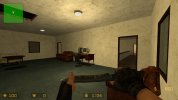
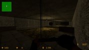
[test needed] zm_mansion (second post)

12 Aug 2022
16
9
3
Having finally set up my new computer a couple of months ago, I resumed work on the map I started way back in the summer of 2022. Thanks to some very helpful feedback from Soup, I've gotten it to a point of completion in which I feel comfortable sharing it here.
The gameplay style of this map is less about camping on top of large crates, and more about players having to utilize physics props to barricade one of several forts for as long as possible, with each fort having carefully designed weak points so that no one spot is too overpowered.
There's always somewhere to fall back to if your fort gets overrun, but the map is heavily interconnected, so there's no guarantee that your fall back location is safe (no dead end camping spots), which will hopefully encourage CTs to put more care and effort into watching their surroundings, which I hope will make for a decently balanced map that gives the CTs a fair shot while also being fair to Zombies. Let me know what you think!
 

Attachments

  • zm_mansion.bsp
    8.7 MB · Views: 62
The map idea sounds interesting. I looked at your map, and it seems to me that your campsites are more or less balanced. But there are places that seem strange to me.

This roof is very large and can accommodate many people. It will be difficult for zombies to get on it, given that they will have to run along fences from which they will most likely be thrown
1712471727486.png


In terms of optimization, your map is not very well made. All these textures under the map need to be overlaid with a nodraw texture. It’s also worth fixing the skybox so that no one can run on it
1712471935489.png


This place also seems strange to me. If people stand in these positions opposite each other, then there can be a lot of teamkills. If all the people stand on one side, then they can easily control this entire area and shoot through the bars.
1712472032232.png


And finally: This is not that important, but I think many hunters will find it annoying. The ground is very uneven, like waves in the sea, perhaps you should smooth the surface a little to make it easier to shoot while running. But this is not necessary, this is my personal dissatisfaction, maybe someone will like this solution)
1712472180121.png


In conclusion, I can say that the map really looks interesting. This is something I'd like to try! At first it seemed to me that the map was too small, but underground passages solve this problem.

EDIT:
Another problem that I discovered. I don't think it's intended that way, but if you fill this passage with objects, it's guaranteed to remain there until the end of the round, and will only hinder the players. Knowing the players, they will do so
1712472725855.png
 
Last edited:
As I understand, this is your first map, I recommend that you read the optimization guides so as not to burden your computer with unnecessary texture downloads, which will not be visible in any case.
 
Welcome back!

Please dont open multiple posts for the same map, no reason not to use the original thread for posting updates mate.
 
My thoughts after a first look:

Less is more. Too many bookshelves, too many sodas. Those props make a lot of spots almost unbeatable for zombiez. For example:
1712482073056.png


1712482102288.png

here are even more sodas to use for blocking the stairs:
1712482129119.png


1712482159757.png


1712482169881.png


We gonna need a prop blocker here:
1712482254746.png


A single soda here and this spot is invincible - and there are 4 sodas directly outside. This spot needs a second entrance anyways, even if you add a prop blocker:
1712482481174.png


I agree with Raider, this ladder will be blocked with the inflationary existing sodas.

Same here: Bookshelves and 4 sodas and 2 sofas and many more props... this is enpugh to barricade 4 rooms forever. The entry will be blocked, no chance for zombiez niot to get in, Only chance fot CTs to go in is barricade destroying:
1712482804843.png

If you use a bookshelfe make sure there is a maximum of 2 props in the same area to build a barricade. I recommend 1 soda + 1 sofa or 2 sofas.

Here too, 2 sodas are enough to pernanently block the small door if placed correctly:
1712482959525.png


The roofs might cause problems too, as all roofs make this map an auto sniper paradise.
 
The map idea sounds interesting. I looked at your map, and it seems to me that your campsites are more or less balanced. But there are places that seem strange to me.

This roof is very large and can accommodate many people. It will be difficult for zombies to get on it, given that they will have to run along fences from which they will most likely be thrown
View attachment 18926

In terms of optimization, your map is not very well made. All these textures under the map need to be overlaid with a nodraw texture. It’s also worth fixing the skybox so that no one can run on it
View attachment 18927

This place also seems strange to me. If people stand in these positions opposite each other, then there can be a lot of teamkills. If all the people stand on one side, then they can easily control this entire area and shoot through the bars.
View attachment 18928

And finally: This is not that important, but I think many hunters will find it annoying. The ground is very uneven, like waves in the sea, perhaps you should smooth the surface a little to make it easier to shoot while running. But this is not necessary, this is my personal dissatisfaction, maybe someone will like this solution)
View attachment 18929

In conclusion, I can say that the map really looks interesting. This is something I'd like to try! At first it seemed to me that the map was too small, but underground passages solve this problem.

EDIT:
Another problem that I discovered. I don't think it's intended that way, but if you fill this passage with objects, it's guaranteed to remain there until the end of the round, and will only hinder the players. Knowing the players, they will do so
View attachment 18930
What raider said about the optimizsation is very important, fix the skybox it should not be a box surrounding the map and the textures outside should be nodraw, or else the map will have poor fps.
 
My thoughts after a first look:

Less is more. Too many bookshelves, too many sodas. Those props make a lot of spots almost unbeatable for zombiez. For example:
View attachment 18931

View attachment 18932
here are even more sodas to use for blocking the stairs:
View attachment 18933

View attachment 18934

View attachment 18935

We gonna need a prop blocker here:
View attachment 18936

A single soda here and this spot is invincible - and there are 4 sodas directly outside. This spot needs a second entrance anyways, even if you add a prop blocker:
View attachment 18937

I agree with Raider, this ladder will be blocked with the inflationary existing sodas.

Same here: Bookshelves and 4 sodas and 2 sofas and many more props... this is enpugh to barricade 4 rooms forever. The entry will be blocked, no chance for zombiez niot to get in, Only chance fot CTs to go in is barricade destroying:
View attachment 18938
If you use a bookshelfe make sure there is a maximum of 2 props in the same area to build a barricade. I recommend 1 soda + 1 sofa or 2 sofas.

Here too, 2 sodas are enough to pernanently block the small door if placed correctly:
View attachment 18939

The roofs might cause problems too, as all roofs make this map an auto sniper paradise.
Looking back at some of the feedback, I do quickly want to address the wooden structure which you said needs a second entrance. The roof to that structure is actually breakable (though perhaps I should create some visual indicator to make it more obvious for players).

Currently working on optimizing the map and will probably lessen the number of props in certain spaces, as per people's suggestions 👍
 
As I understand, this is your first map, I recommend that you read the optimization guides so as not to burden your computer with unnecessary texture downloads, which will not be visible in any case.
Can you point me in the direction of said optimization guides?
 
Damn, everything i ever heard of mapping mentioned tophatwaffle, mf carrying hammer mapping
 
I've made several updates to the map based on the above feedback
1. Optimization
-Skybox brushes are now only where the skybox is visible instead of it being a large hollow cube surrounding the map (there's also a skybox at the bottom of the map, but that was necessary for preventing leaks)
-Applied nodraw texture to geometry outside of the viewable map space.
2. Gameplay
-Adjusted and reduced the number of props for certain spaces
-It was mentioned that the roof of the red/wooden structure in the corner of the grass field could make for an OP camping spot, so I split the roof into three breakable sections and made the interior a little easier for zombies to take
-For the concrete structure in the grass field that leads to underground, I put a cage around the hole leading underground so props cant be shot into it
-For the doghouse behind the garage, the roof was already breakable, but I sloped some of the corners to make it more obvious, and also added a 32 unit box beside the doghouse so players get the hint.
3. A few things I opted to keep as they are
-Some people mentioned the roof to the mansion can make for an OP camping spot, but there's already 4 ways to get up there, so it's not like CTs are super secure up there
-There were some gameplay concerns about the sewer space, and I did consider making changes, but I've decided that I want to see how it plays in practice before making any changes, since it's kind of an unusual area.
Enjoy!
 

Attachments

  • zm_mansion.bsp
    7.8 MB · Views: 118
  • Like
Reactions: Raider Wesley
you need to rename the map with every map version you create (fixes, changes, etc). See here
 
you need to rename the map with every map version you create (fixes, changes, etc). See here
we never uploaded the first ones so that isn't strictly necessary in this case, but yes generally you should change the map name with updates, on the server it wouldn't work if the name wasn't changed between versions
 
you can get stuck in this corner between the bin and the tree
1715266121224.png


additionally, I think it may be better to remove most of the doors inside of the house. there are many doors in quite a small space and they are probably more annoying and possibly problematic than anything else, I don't really see the need for it inside the house
 
Fixed the player stuck spot described above
Going to hold out on the matter regarding the doors as I prefer to see how that plays in practice first
 

Attachments

  • zm_mansion_v27.bsp
    7.8 MB · Views: 53
Fixed the player stuck spot described above
Going to hold out on the matter regarding the doors as I prefer to see how that plays in practice first
To be clear, I consider the map, in the form of this file (zm_mansion_v27.bsp), to be done, unless any other glaring issues are spotted