maps | List + Add/Remove requests!

despair wasn't made by the creator of cbble, nor was it well balanced at all... maps don't just get removed if there was never an issue with it
Dude, you're wrong. zm_eh_despair was made by the creator of zm_cbble. You can open both maps and check for yourself. At the start, the console displays a message in the chat about who created them.
You may be right about the balance. Perhaps in practice, some problems that were not obvious to me were discovered. I judge by visual criteria: the presence of two or more paths to the camping points, the presence of a large open space. No too narrow passages that are easy to hold, etc. If you remember what the problem with this map is and you have the time and desire to explain it, then please explain. I'm really curious.

Moonlight is the creator of original cbble. Current version uploaded on server was further optimized/fixed by [EH] Coco and Wolfram.

TheRalle is the creator of zm_eh_despair. So lotus is right.
 
I would Like to See some Maps Back in normal Rotation. I guess 5 or 6 Maps More would be great.

Origin, Undergrounds,Despair, Filth for Example.

These we're kinda good Balance. More balanced Like Other Maps which are already in Normal Map Rotation.

Also Chambers and Atix Panic are some Favorites, even they are Not good balanced. Would be nice to See them Back in normal Rotation.

Like i Said, If you already got Maps in Rotation that are Not balanced at all like

little Italy, Clouds, Kapras, Lila Epic, Dino Day for Example.

Just add some More Special Maps to normal Rotation pls, that would be great.

Regards
I have already proposed to return back zm_eh_despair, but Lotus says it's has balance issues🤷‍♀️
 
What did you guys do to "FIX" highway_final ... that map sucks now ... why ruin the most fun ramps
It was the only map with highspeed and fun as zombie
 
What did you guys do to "FIX" highway_final ... that map sucks now ... why ruin the most fun ramps
It was the only map with highspeed and fun as zombie
We always strive to make the maps balanced, but we do look at feedback.
 
I am sorry but that map was fun ... now it aint
Well, like i said it was very unbalanced before zombies could just fly around the whole map taking down cts and making it unbalanced, if you mastered the jump you could use it to reach almost all spots for cts. Hence we needed to fix it.
 
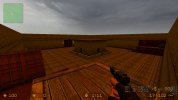
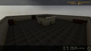
I rarely make maps, here is my take on creating one, feel free to have a look and make adjustments. However, it is a simple 'hunt' map, I did not had time to add more detail.

I like the underground area but the top area is very basic, like the underground area has good light and you seem to have spent more time working on that.
 
I like the underground area but the top area is very basic, like the underground area has good light and you seem to have spent more time working on that.
I agree, the underground area looks very cool. The surface is very weak. Even just adding a 3D skybox would have brought it to life more.
 
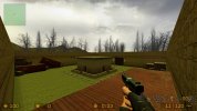
Thanks for the feedback. Now that I look at it... it is indeed boring. So I added more light, containers, etc. Maybe I added to much sun in the updated version, Still have to work on some details.
 

Attachments

  • 20240818165034_1.jpg
    20240818165034_1.jpg
    156.9 KB · Views: 39
  • 20240818141254_1.jpg
    20240818141254_1.jpg
    542.4 KB · Views: 40
Thanks for the feedback. Now that I look at it... it is indeed boring. So I added more light, containers, etc. Maybe I added to much sun in the updated version, Still have to work on some details.
Looks better but what Raider said is true, a 3d skybox would greatly improve this map right now it looks like a little room in the middle of the sky haha, and also optimize the map with area portals for the up and down area
 
Took a while, but got it to work and it looks a bit better. But got to smooth it a bit. Will have to look at it another time, maybe next weekend
 

Attachments

  • 20240818202500_1.jpg
    20240818202500_1.jpg
    175.3 KB · Views: 44
  • Like
Reactions: Raider Wesley
Thanks for all the feedback and ideas, I just released a optimized rework on the map. Optimizing was so terrible to do, finding leaks made tears leak from my eyes
 
Thanks for all the feedback and ideas, I just released a optimized rework on the map. Optimizing was so terrible to do, finding leaks made tears leak from my eyes
Also, I made a blood edition... if you ever want to add it, or want to make modifications, feel free to do so. Think I have the final version done.... for now.