New hunting map zm_ghost_ship_beta
- Thread starter Janno Norbaten
- Start date
You are using an out of date browser. It may not display this or other websites correctly.
You should upgrade or use an alternative browser.
You should upgrade or use an alternative browser.
Pros: good looking map
Cons: No camp spots for v3 players which Will eventually lead to everyone rtv the map trust me
https://gyazo.com/901d1de06f5a07648aa31c5bf68fde84 - Got some vhpysics errors and sound errors at the start of the round
https://gyazo.com/0553cb3ff5277fa0445079f2797b07ee - i noticed you have alot of props packed together this could lead to big fps drops in the future.
https://gyazo.com/77aa4314614528c9572a06addc76050d - I see alot of decals in the map and not info_overlay this will also decrease fps since you have alot of them around.
https://gyazo.com/14a96889220bbc0f5460f2776d77e181 - The prison door on the left kept swining open and bugging out when the jail was active.
Also the map is very narrow and compact so its going to be hard to hunt there from what i experienced, but only time can tell if it gets tried on v3
I hope this feedback helps!
Last edited:
thx for your help.
"zh_" means this is a map for "zombie hunters" , i built already a map for the common v3 players.
There is a princip behind the map.
1. You have to controll areas ,if you have defend this areas against the zombie mass, you have to hunt the last zombies, that is the main goal.
2. The areas are really easy to control ,the ways are small and there is mostly only one way to the area.
3. I make the hunting easier in small rooms with light signals, if a zombie stand behind a edge the light flickers or enable light when zombie stands in a room.
4.This map should give the players a hunting experience.
The thrill when you know there is a zombie behind the edge ,and everything depents on your reflexes and the right moment.
Your team stands behind you and watch you if you lose or success after this your team have to react on this.
Or the thrill when you drive up/down in the elevator with a small team and you dont know if you team will succeed.
furthermore the design and the effects should intence the thrill, like the squeaky elevator ^^ and the flickering light.
Your team stands behind you and watch you if you lose or success after this your team have to react on this.
It think this way it is more likely: "Your team stands behind you and blocks you..." :-D
yes that could be problematic  but you can decide if you go into the elevator with a hord of noobs.
it would be really funny when you see them go up and get infect after 20 sec.
after that they will come down in the elevator and you can kill them easy.
it would be really funny when you see them go up and get infect after 20 sec.
after that they will come down in the elevator and you can kill them easy.
now i changed a lot of decals into overlays and i add more occluders to improve the graphic performance.
I fix the sporadic elevator bug (you got teleported when you go into)
I added clouds and fog and a lot of more effects and details.
I changed the tail of the ship now you can walk around the commando bridge.
I fix the sporadic elevator bug (you got teleported when you go into)
I added clouds and fog and a lot of more effects and details.
I changed the tail of the ship now you can walk around the commando bridge.
Attachments
tested on V1 without any faults.
People often say that the map is maybe to little , i will add maybe a machine room. (in progress)
People often say that the map is maybe to little , i will add maybe a machine room. (in progress)
I like the zombie maps and this looks like one I would play on. I agree with the camping spots for human players as i am one to hide with a group of others or sometimes find the best place I can away from zombies.
Nice work though
Nice work though
I think when players play a new map they challenged to search for the best camp spot , but there they will find not one in the frist round , nothing. (not like dust2 or azsszeduct)
They have a new challenge in the second round :"what will I do to dont be infected, there must be away to alive" and yeah there is a way , stay together .
The small ways are really really easy to defend, this map is not nearly so difficult like office_rush or dust2.
I want to give the players a easy challenge on this map "to defend areas" , the more difficult challenge for the professionals is " to hunt the zombies".
I think there is no map in the map pool with this balancing ,it is a kind of experiment.
maybe this map is to easy ?
Love the map, but I believe its need more spots/space and perhaps it's not enough spawning slots for 64 players? Tryed it on v1 and brings back some memories from zm_roy_the_ship. 
I know you what you were writing above me Janno, but maybe it'll be a mess with 64 players?
I know you what you were writing above me Janno, but maybe it'll be a mess with 64 players?
yeah, i know your concerns.
I will extend the map with a machine room and make the area below deck longer.
There is enough space in the ship to create more rooms it is ca. 2 times so huge like roy_the_ship.
But it is a lot of work to add more rooms and keep the gamebalance in mind.
I will extend the map with a machine room and make the area below deck longer.
There is enough space in the ship to create more rooms it is ca. 2 times so huge like roy_the_ship.
But it is a lot of work to add more rooms and keep the gamebalance in mind.
the machine room will be a funny spot too, zombies can close this area and cage the humans.
A Siren and red light gets activtated , the human have 8 sec. to get out, than the room gets dark with weak red light.
The humans outside can see through a window how the cought humans fight against the zombies or get invected. "Schadenfreude"

A Siren and red light gets activtated , the human have 8 sec. to get out, than the room gets dark with weak red light.
The humans outside can see through a window how the cought humans fight against the zombies or get invected. "Schadenfreude"

Last edited:
Hi ,
here is a new Version of zm_ghostship :
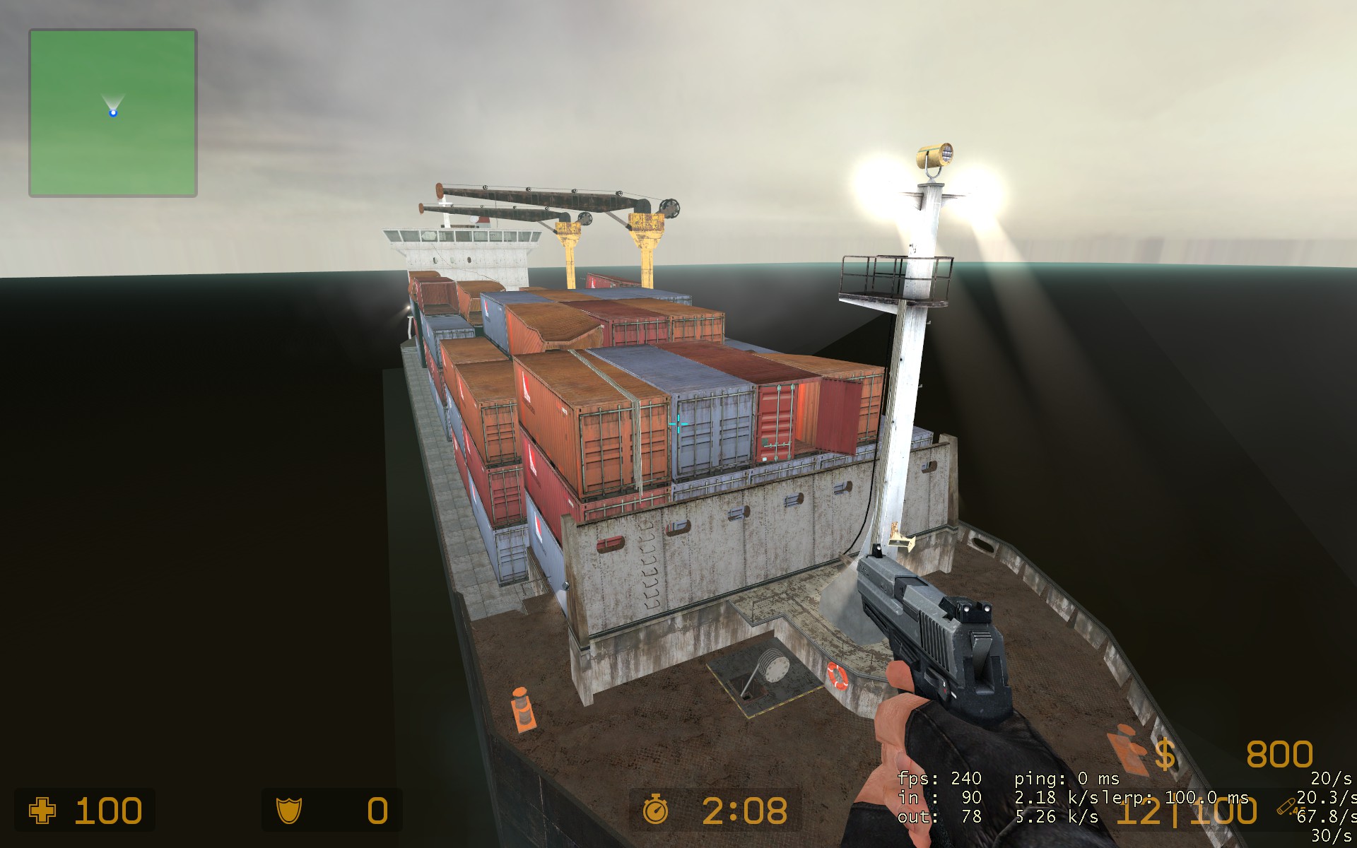
- the map uses now 3 times more space on the ship than before (+ engine Room , +3 Storage Roomes, + acces to the top of the Containers).
- _nl1 = compiled without lights version , because people like bright maps where you can identify zombies quickly. ( the light version looks like the other attached images and is also available )
- no music added
- added more camp spots
Attachments
-
 zm_ghost_ship_v10009.jpg423.1 KB · Views: 156
 -
zm_ghostship_nl1.zip12.4 MB · Views: 184
-
 zm_ghost_ship_v10011.jpg401.6 KB · Views: 152
 -
 zm_ghost_ship_v10012.jpg487.2 KB · Views: 148
 -
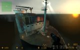 zm_ghost_ship_v10013.jpg277.1 KB · Views: 145
 -
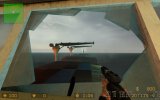 zm_ghost_ship_v10014.jpg260.5 KB · Views: 149
 -
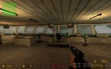 zm_ghost_ship_v10016.jpg510.3 KB · Views: 146
 -
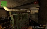 zm_ghost_ship_v10018.jpg466.7 KB · Views: 148
 -
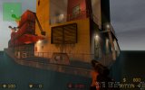 zm_ghost_ship_v10025.jpg342.7 KB · Views: 155
Last edited:
That is some beautiful shit - sorry SHIP, there - good old map - I look forward to play it
Really nice - looks good
Really nice - looks good
Don't get me wrong,I like the idea of reworking this map to be playable on V3,but it looks kinda..misleading to me? Here's what I personally noticed:
- Vent opening area that is misleading because it actually cannot be used:
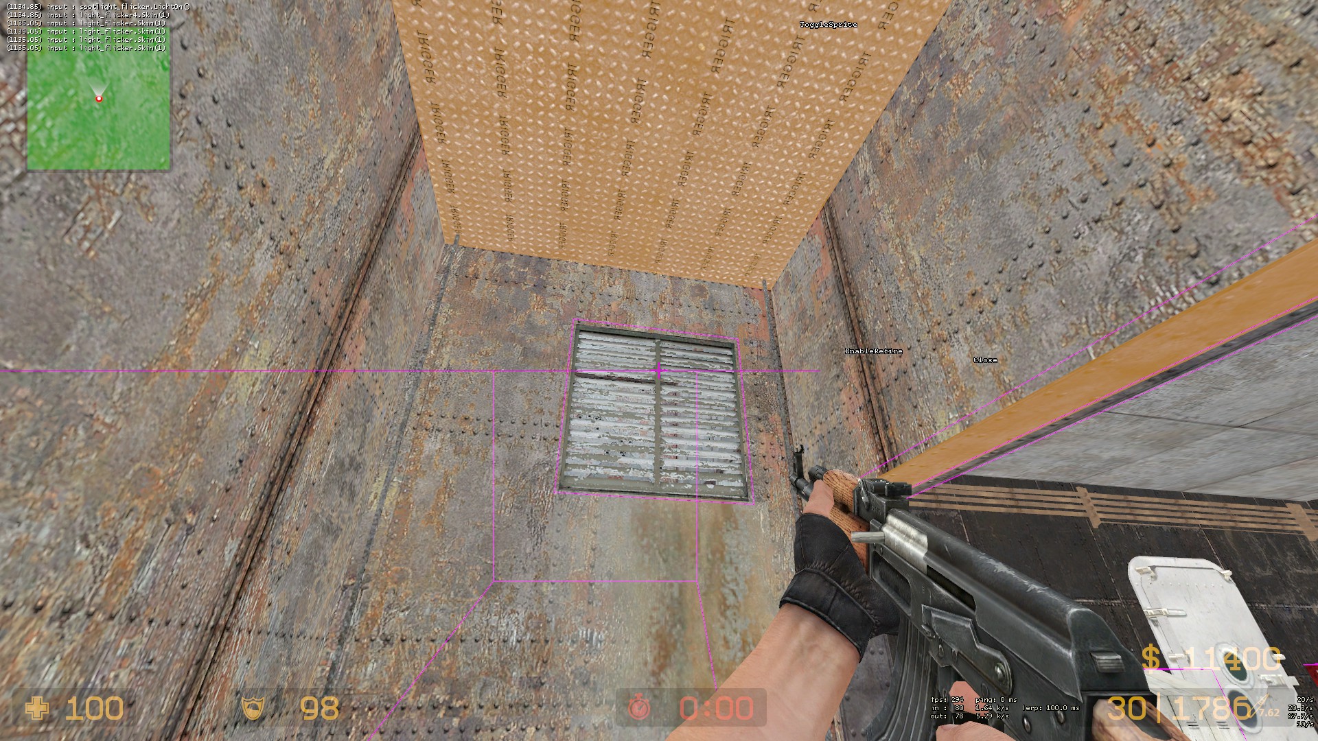
- Also a lot of doors that seem accessible but are actually not,I would suggest marking them in some way,probably with big "LOCKED" letters on the outside or marking them with a big red "X".Here are a few doors im talking about:
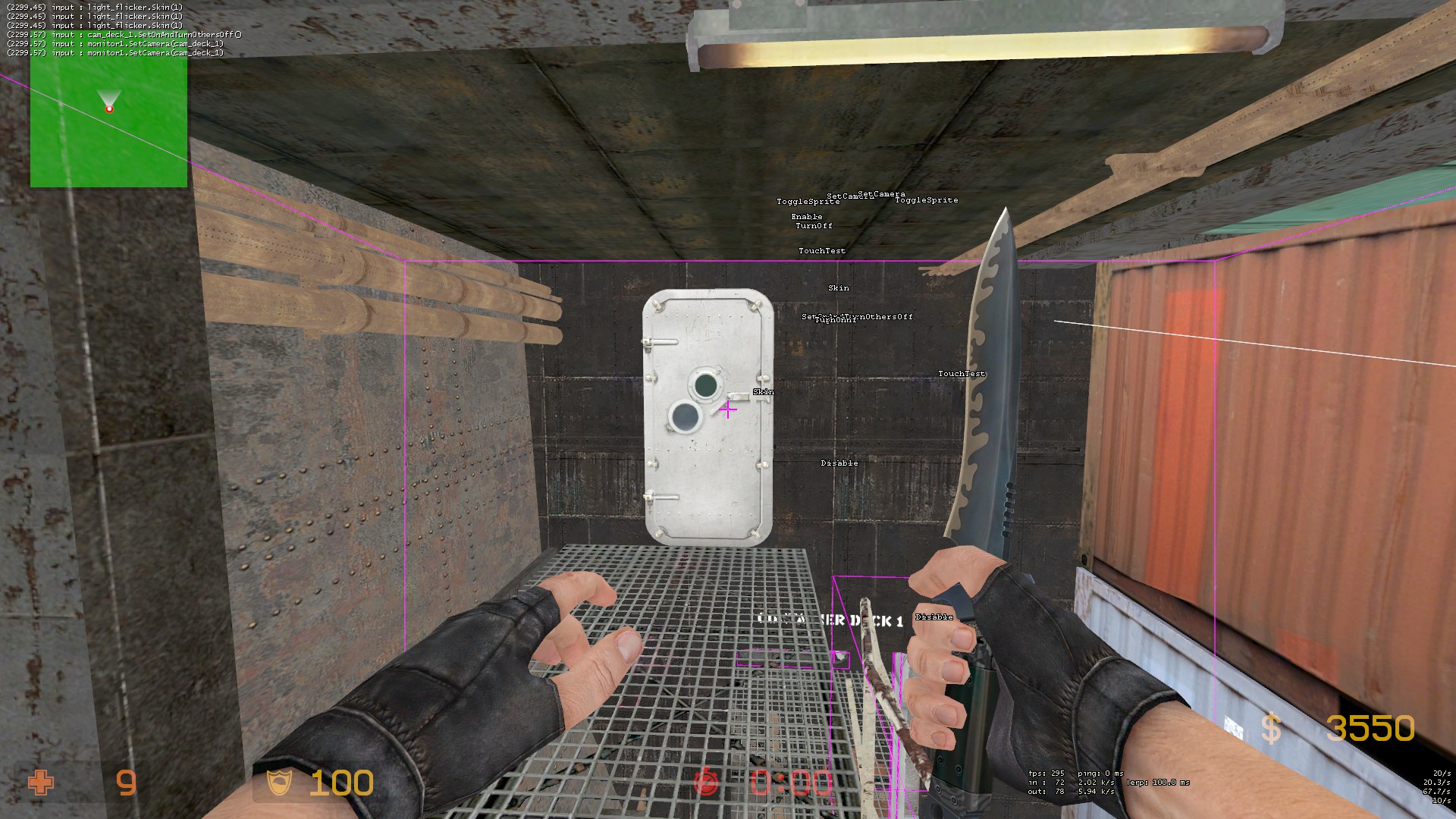
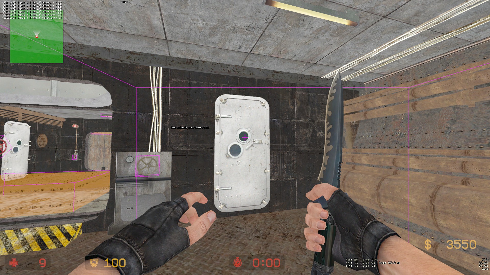
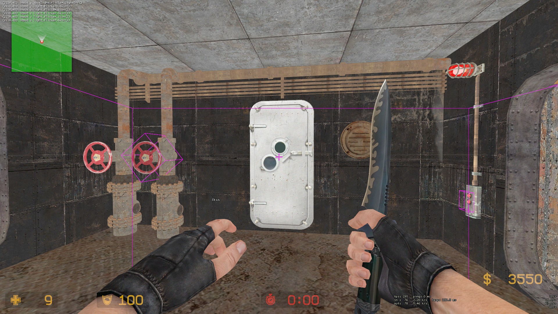
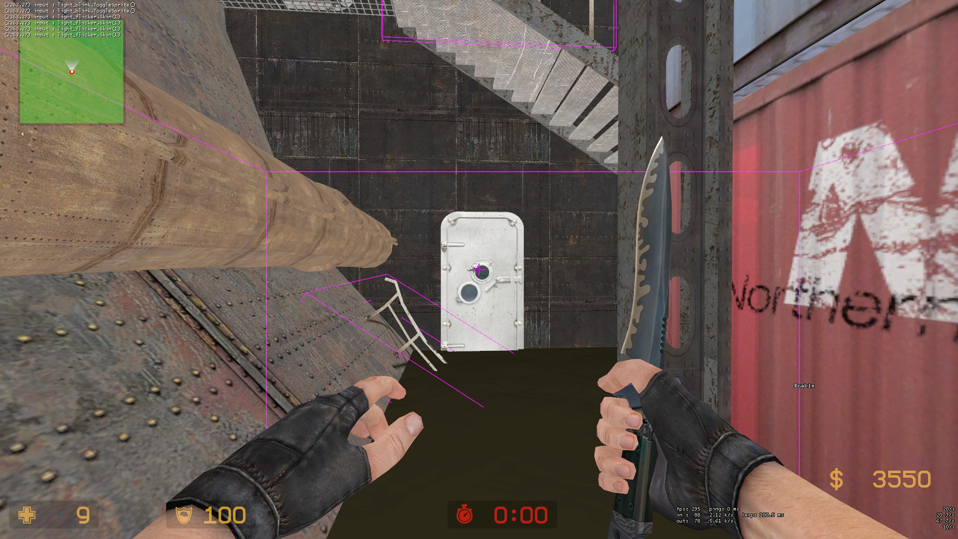
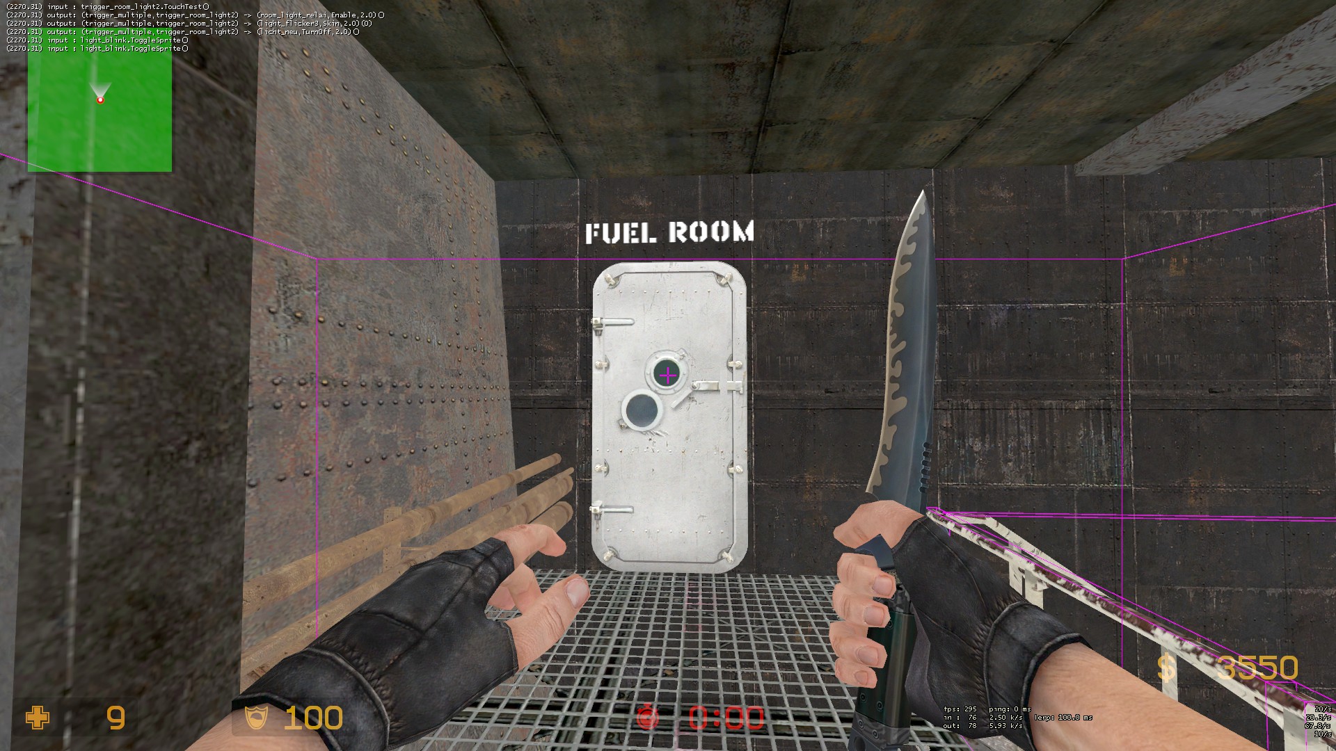
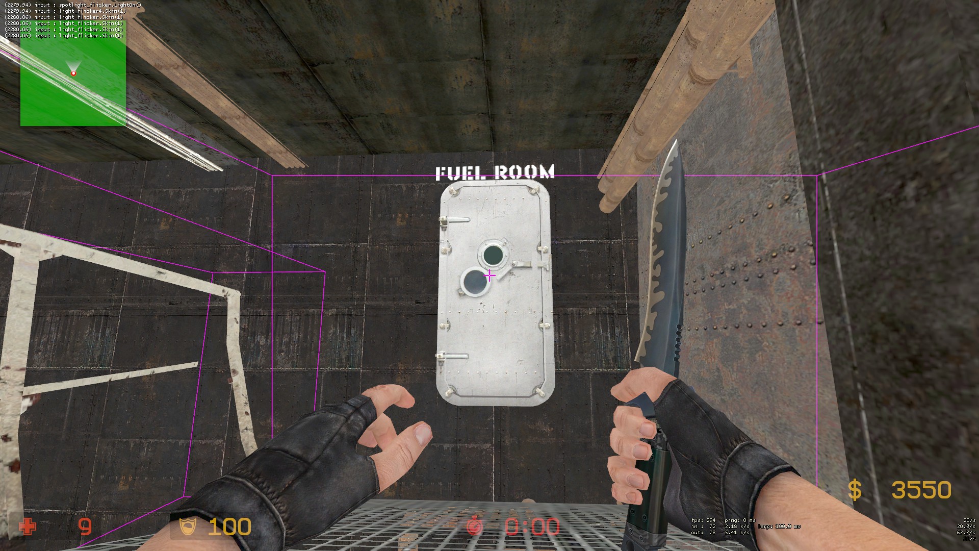
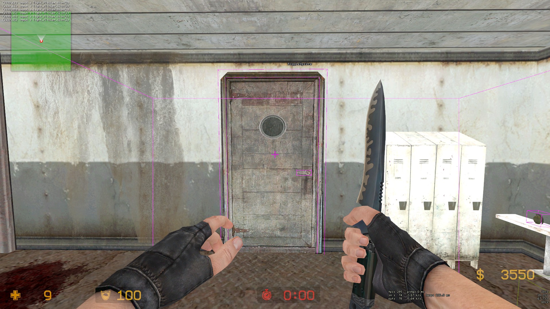
- One more small thing: These little glass windows actually don't have any glass on them,you can straight up throw nades through them/shoot with your shotgun:
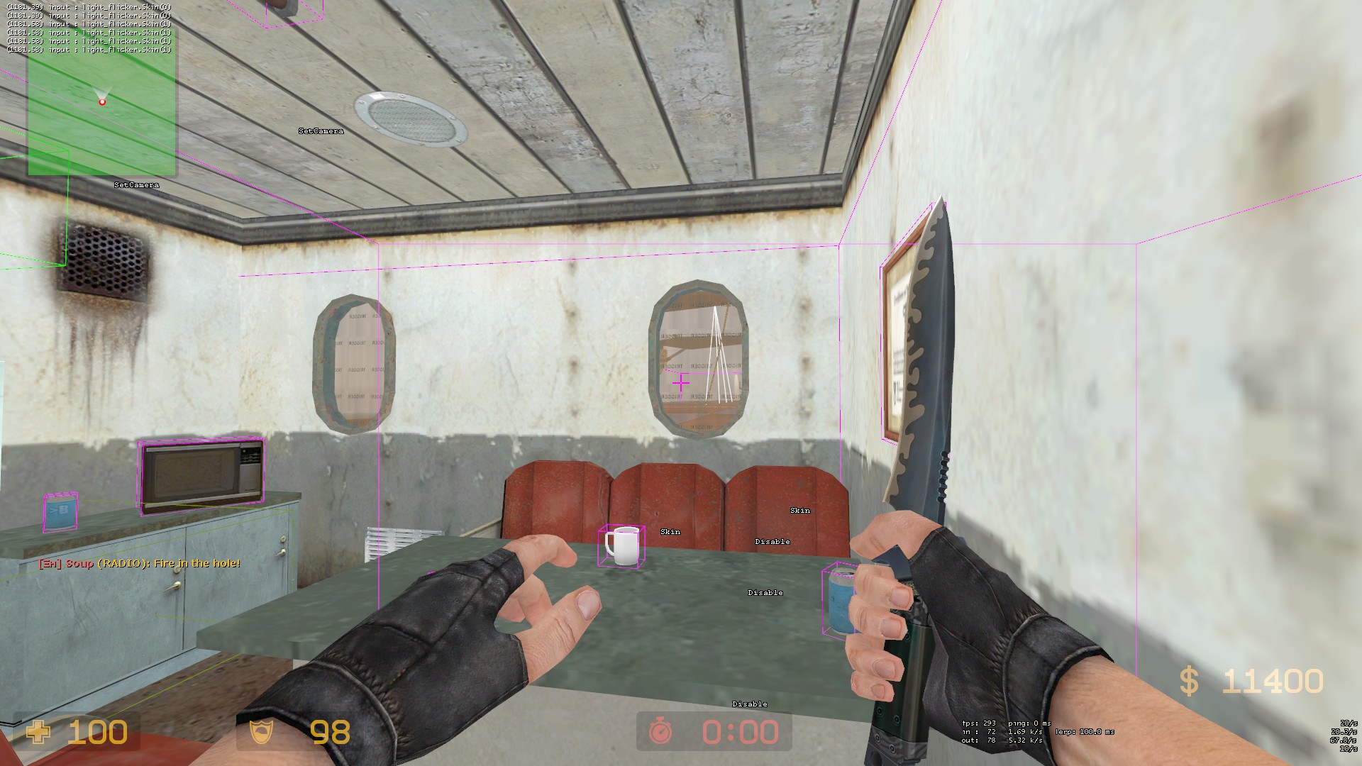
Other than that,the whole container/outside area looks really good to me,It's the underground crumped hallways I am mostly concerned about.
- Vent opening area that is misleading because it actually cannot be used:
- Also a lot of doors that seem accessible but are actually not,I would suggest marking them in some way,probably with big "LOCKED" letters on the outside or marking them with a big red "X".Here are a few doors im talking about:
- One more small thing: These little glass windows actually don't have any glass on them,you can straight up throw nades through them/shoot with your shotgun:
Other than that,the whole container/outside area looks really good to me,It's the underground crumped hallways I am mostly concerned about.


